Evolva's new visual identity
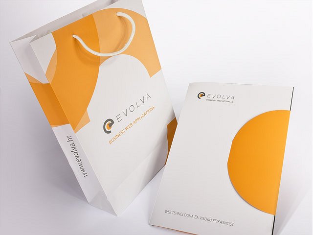
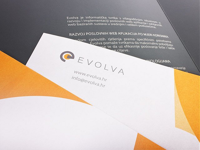
Just as we care about the quality of our code, we pay particular attention to the quality of our visual presentation. With a goal to successfully communicate company values, a corporate design was created with graphic standards and templates for business documents.
What Evolva's logo symbolizes
The Evolva company logo is based on the character "e" which has multiple meanings. Besides representing the first letter of the company name, it also symbolizes the word efficiency which is one of the basic qualities of Evolva services and solutions. It also signifies the word evolution and that analogy is further enhanced by an orange circle and spiral curve symbolizing the exponential growth that Evolva's solutions brings to customers.What is the visual identity based on
To highlight the company's long tradition and the power of its web technology, the visual identity is based on gray-scale components with an orange circle as a symbol of the internet network that underlies Evolva's solutions. Corporate standards ensured recognition in the market and high quality business presentation, and thus, through the use of modern elements, successfully expressed core values of the company.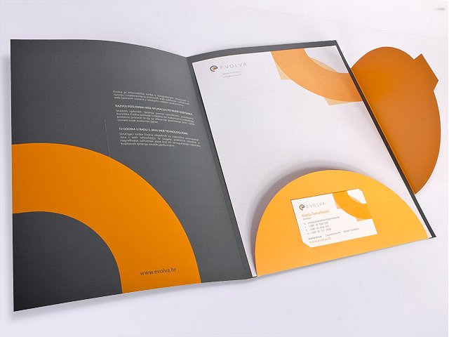
News archive |
| Show all news |
| Show only: |
| Corporate news |
| Evolva solutions and services |
| Evolution Framework |